Custom Properties
Formation studio allows you to specify custom properties for your
Custom Widgets. Owing to the adaptive nature of how the studio
handles properties adding custom properties is relatively easy. The studio
relies on proper implementation of the configure, keys, cget,
__getitem__ and __setitem__ methods of a widget for custom properties
to be correctly detected. Luckily, formation provides utilities
to achieve this through the CustomPropertyMixin
Let us add a custom properties button_color and button_bg to our Dpad widget. We will
modify our class to use the CustomPropertyMixin
as shown below
from tkinter import Frame, Button
from formation.utils import CustomPropertyMixin

class DPad(CustomPropertyMixin, Frame):

    prop_info = {
        "button_color": {
            "name": "button_color",
            "default": None,
            "setter": "set_btn_fg",
            "getter": "_btn_fg"
        },
        "button_bg": {
            "name": "button_bg",
            "default": None,
            "setter": "set_btn_bg",
            "getter": "_btn_bg"
        }
    }

    def __init__(self, master, **kw):
        super(DPad, self).__init__(master, **kw)
        self.left = Button(self, text="L", padx=8, pady=5)
        self.right = Button(self, text="R", padx=8, pady=5)
        self.up = Button(self, text="U", padx=8, pady=5)
        self.down = Button(self, text="D", padx=8, pady=5)

        self.up.grid(row=0, column=1)
        self.left.grid(row=1, column=0)
        self.right.grid(row=1, column=2)
        self.down.grid(row=2, column=1)

        self._btns = [self.left, self.right, self.up, self.down]

        self._btn_bg = self.left["bg"]
        self._btn_fg = self.left["fg"]

    def set_btn_bg(self, val):
        for i in self._btns:
            i["bg"] = val
        self._btn_bg = val

    def set_btn_fg(self, val):
        for i in self._btns:
            i["fg"] = val
        self._btn_fg = val
Note
The CustomPropertyMixin is not necessary if configure, keys and the
other methods are already implemented to accommodate you custom properties.
It is however advisable to use the mixin as it has been thoroughly tested and
is less prone to issues.
Our widget is ready for use. We still need to inform the studio on how our properties should be handled and what type of values they contain. The studio supports the following property types:
choice : Allows selection from a set of values using a dropdown widget. Options are specified as a tuple using the
optionskey.boolean : Selection of true or false using a checkbutton
relief : Allows selection from the available relief types in tkinter
cursor : Allows selection from available cursor types in tkinter
bitmap : Allows selection from the built-in bitmaps
color : Provides a colorpicker dialog to select colors
text : Allows entry of arbitrary text
textarea : Similar to text but allows entry of longer texts.
number : Entry of integers
float : Entry of floating point numbers
duration : Allow entry of durations. You can specify the
unitsoptions which can be one of (‘ns’, ‘ms’, ‘sec’, ‘min’, ‘hrs’).font : Selection from available system fonts. It also includes a font picker that can pick fonts from anywhere within the studio.
dimension : Entry of dimension. Currently only supports pixels
anchor : Allows easy setting of anchor and sticky values by providing realtime preview of anchor/sticky behaviour on a dummy widget. Setting the
multipleoption allows the application of multiple anchors simultaneouslyimage : Allows user to pick an image from their local machine
variable : Allows user to select from variables created by the
Variable panestringvariable: A variation of the variable type that only allows selection of
tk.StringVar
Note
It is currently not possible to implement your own types but we hope to make allow custom types in future.
To specify the types our custom properties, we will modify the meta class as shown below:
class DPadMeta(DPad, metaclass=WidgetMeta):
    display_name = 'D Pad'
    impl = DPad
    icon = "gaming"
    is_container = False
    initial_dimensions = 90, 100

    DEF_OVERRIDES = {
        "button_color": {
            "display_name": "button color",
            "type": "color",
            # you can specify additional options supported by type here
            "name": "button_color"
        },
        "button_bg": {
            "display_name": "button bg",
            "type": "color",
            "name": "button_bg"
        }
    }
DEF_OVERRIDES is a special attribute checked at runtime by the studio to
make decisions on what properties to display and how. You can also override
behaviour of default properties by specifying alternative definitions here.
Note
The key and the name should always match to avoid issues.
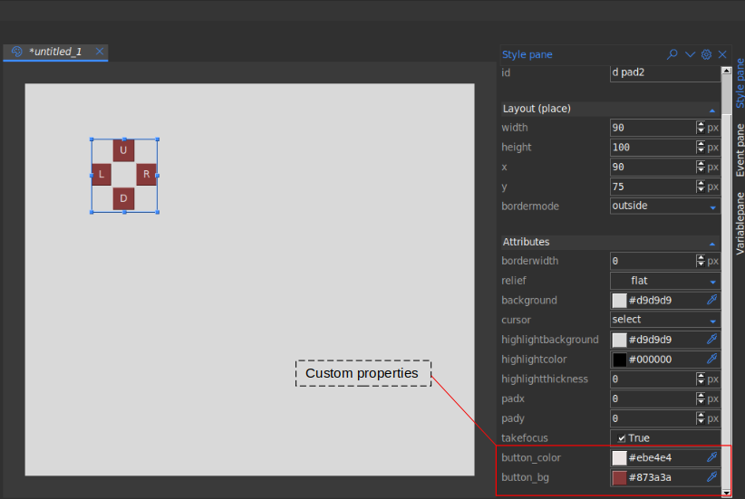
Assuming your widget is properly setup as explained in Custom Widgets, if
you open the studio and use your custom widget, the custom properties will
appear in the attributes section on the stylepane as shown below