Formation is a design tool intended to make the work of tkinter UI designers easy
by providing an intuitive drag drop interface. It allows designers to employ all layout managers (Pack, Place and Grid)
to flexibly achieve various design goals. For ease of implementation the designer itself is written in what we like to
call contemporary tkinter provided by the hoverset library. You can view the widget catalogue at hoverset.ui.widgets. The supported widgets have been organised into families of
widgets referred to here as widget sets and include:
A feature is a complete tool window providing means to manipulate the design
file. Below are core features implemented in the formation studio:
Drag drop designer: Formation provides an easy to use drag drop designer. The designer can be expanded to full
screen display to allow focus on design. The designer allows widgets to be moved from parent to parent as needed to
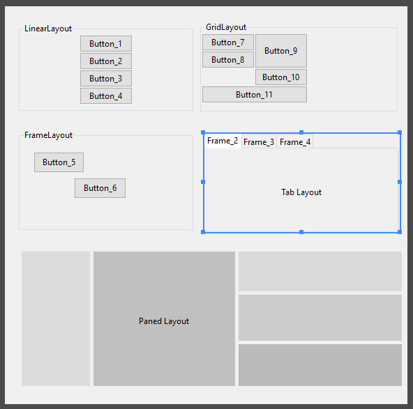
simplify the design process. The designer supports manipulation using the following layout strategies:
pack (formerly LinearLayout)
grid (formerly GridLayout)
place (formerly FrameLayout)
TabLayout (for py:class:tkinter.ttk.Notebook)
PaneLayout (for PanedWindows)
Component library
The component library allows designers to search through the supported widget sets and add them to the designer. They
can filter the components based on their widget sets.
Component Tree
Display the Widget hierarchy and select widgets that may be (due to design) difficult to access directly from the design
pane. Access the context menu of the widget from the component tree which is basically just an extension/handle of the
widget.
Style pane
Access the style and layout attributes of selected widgets. The layout attributes automatically switch to match the
layout manager currently handling the widget. Easily manage a wide range of properties using intuitive editors such as:
Color: Modify color in RGB, HSL and HSV and hex notation as well as pick colors from anywhere on your computer
screen even outside formation itself
Anchor: Intuitively set anchors as well as sticky attributes
Text: Write out text values with ease
Choice: Get all options valid for a given property
Dimensions: Handles all tkinter dimension notations
Boolean: Toggle between boolean attributes with a click
Menu editor
Create and edit menus using easy to use drag and drop gestures. Access all attributes applicable to the various types
of menu items and preview the modified menu with the click of a button.
Variable pane
Create tkinter control variables, access and assign them to widgets in the designer. Modify the values of the variables
on the fly from the manager window. Any control variables added from the manager immediately reflect in the style pane
allowing the designer to assign them to as many widgets as they desire. Control variables provide an elegant way to
set values to connected widgets which rely on the same value.
studio.feature : Contains implementation of the various key components of the designer such as:
studio.feature.component_tree
studio.feature.design
studio.feature.components
studio.feature.stylepane
studio.feature.variablepane
These components all implement studio.feature._base.BaseFeature which abstracts all Feature behaviour
and manipulation which can then be built upon if special behaviour is needed. It contains methods that
are to be overridden so as to handle events broadcast by the main application such as change in widget
selection or deletion of a widget among others.
studio.lib : Contains implementation of widget sets, complete definitions of their properties, behaviour. It also
has implementation for the various layouts used by the designer. Definitions and implementation of menus and properties
that can be applied to the menu components can also be found here. The files under this folder are:
studio.lib.properties: definition for all widget properties modifiable by the style pane.
studio.lib.pseudo: Base classes for widgets used in the studio designer with added functionality to allow for easy
manipulation. Definition for container widgets can also be found here
studio.lib.menu: Utilities and definitions for handling menus in the studio
studio.lib.variables: Classes for managing tk variables in the studio
studio.parsers : Contains implementation for classes that handle conversion from various designated file formats to
design view and vice versa. Currently on only xml defined in studio.parsers.xml format is supported but if any other formats are to be
added this would be the package location
studio.ui: Contain implementation of widgets and user interface components used in the studio. The included are:
studio.ui.editors: The ui elements used to modify various widget properties as explained in the style pane feature
studio.ui.geometry: Access, analyse and manipulate position and sizes of widgets used by various studio routines
studio.ui.highlight: Transient widgets used to guide designers to which widgets currently have focus. Also contains
implementations for resizing and moving widgets in the designer
studio.ui.tree: Implementation of base class for the tree view widgets used in the studio which allows easy manipulation
using drag drop gestures
studio.ui.widgets: Assortment of special widgets used in the studio
studio.ui.about: The about window for the studio
studio.main: Contains the entry point of studio user interface. Implementation
for general functionality and the coordination of feature windows can be found
inside the studio.main.StudioApplication class